Why Every Marketing Agency Needs a Conversion-Focused Website Today
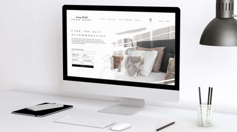
Your Website Isn’t Just a Portfolio Anymore
In a digital world flooded with options, your marketing agency’s website is no longer just a static portfolio or an online business card. It’s your 24/7 growth engine, your top-performing salesperson, and often the first impression a potential client forms about your capability. And if it isn’t built to convert — you’re not just losing traffic, you’re losing business.
The traditional agency website was designed to impress. Full-screen sliders, motion effects, animated case study logos — all the bells and whistles to signal creativity. But in today’s high-competition, conversion-driven environment, visual aesthetics without strategic purpose are meaningless. Users care less about how beautiful your site looks and more about how easily they can find answers, solve their problems, and take the next step.
Your website needs to do more than showcase — it needs to convert. And conversion doesn’t happen by accident. It happens when every pixel, every word, and every button is deliberately designed to lead the visitor from curiosity to conversion.
The Evolution of Agency Websites (2020–2025)
The shift from vanity to value in web design has been dramatic. In 2020, agency websites served as digital lookbooks — heavy visuals, sparse copy, and minimal focus on CTAs. Fast-forward to 2025, and the highest-performing agencies have flipped the model. They’ve transitioned to fast-loading, copy-rich, conversion-driven designs.
Here’s how the landscape evolved:
Old Model (Pre-2020) | New Model (2025 & Beyond) |
Design-first, copy-second | Message-first, value-driven hierarchy |
Unclear user flows | Funnel-mapped user journeys |
Passive “Contact Us” buttons | Scroll-triggered, contextual CTAs |
Long case study carousels | Problem-solution-result formatted proof |
Desktop-first design | Mobile-first, thumb-friendly experiences |
The reason? Buyer behavior changed.
- 70% of prospects review agency websites before contact (Clutch, 2024)
- Over 60% of that traffic is mobile (Google Analytics, aggregated benchmarks)
- Average attention span: 8 seconds, which means your messaging must work instantly
Users no longer browse to admire. They scan to decide.
2. Refreshing Old Content for Fresh Rankings
You don’t always need to create more content. Sometimes, the best move is to revive what you already have.
Google favors freshness — especially for YMYL (Your Money or Your Life) and informational content. If your blog was published 18 months ago, chances are it’s:
- Outdated in terms of data or references
- Lacking in modern on-page SEO structure
- No longer matching current search intent
Growthlogy uses a 3-part content audit checklist:
- Performance: Is traffic or ranking dropping?
- Relevance: Is the topic still aligned with audience needs?
- Optimization: Can we improve structure, keywords, visuals?
We then:
- Rework intros and headers
- Add updated sources and stats
- Embed videos, infographics, or newer CTAs
One client updated 5 of their top posts in Q1 and regained 37% lost traffic — with no new content published.
What Is a Conversion-Focused Website?
A conversion-focused website is a digital asset engineered to drive action — not admiration. Every element is optimized to move the visitor through the funnel, from awareness to interest to decision.
It’s Built with Purpose:
- Funnel Strategy: Pages are mapped to TOFU (Top-of-Funnel), MOFU (Middle), and BOFU (Bottom).
- Content Psychology: Headlines aren’t just catchy, they’re outcome-oriented. CTAs aren’t just buttons — they promise transformation.
- Performance-First UX: Site speed, scroll flow, and mobile optimization aren’t optional; they’re foundational.
It’s Measured by Results:
A conversion-focused website isn’t judged by design awards. It’s judged by:
- Form submission rate
- Calendar booking rate
- Scroll depth to CTA
- Page-specific bounce rate
- Lead quality and email capture efficiency
Showcase vs Conversion-Focused
Attribute | Showcase Site | Conversion-Focused Site |
Focus | Looks, visuals | Action, outcomes |
CTA Placement | Footer-only | Sticky, scroll-triggered |
Internal Linking | Sparse | Funnel-driven and strategic |
Content Depth | Shallow, vague | Specific, problem-solving |
Navigation Structure | Cluttered dropdowns | Streamlined, linear journey |
With a conversion-focused site, every section answers a user question. Every visual reinforces credibility. Every interaction moves the user forward.
7 Reasons Marketing Agencies Must Prioritize Conversions
Let’s go deeper than just “it helps you get leads.” A conversion-focused site isn’t a nice-to-have — it’s a revenue multiplier. Here’s why you can’t afford to overlook it:
1. Aesthetics Don’t Equal Performance
Too many agencies mistake beautiful design for effectiveness. A well-designed site that lacks proper CTA hierarchy or has unclear copy is like a Ferrari with no engine. It looks great — until you try to drive results.
Your site must do more than impress — it must convert.
2. Your Site Is Your First Proof of Concept
When you offer performance marketing, CRO, or funnel building — your website becomes your first case study. Clients will assess whether you practice what you preach.
If you can’t convert your own traffic, why should they trust you to convert theirs?
3. High Bounce Rates Undermine Your Authority
When a user bounces within seconds, Google notices. High bounce rates hurt not just your lead pipeline but your organic rankings. It tells the algorithm: this site doesn’t satisfy intent.
A CRO-focused layout keeps users engaged longer — increasing dwell time, scroll depth, and conversions.
4. You’ll Attract Better-Fit Leads
Conversion-optimized sites qualify visitors automatically. Instead of fielding unqualified “Do you offer social media management?” inquiries, your forms are filled by high-intent buyers who know your value.
This reduces time-wasting, improves sales velocity, and increases average deal size.
5. Paid Campaigns Depend on Site Performance
Even if your Google or Meta ads are on point, your site is the bottleneck. A poor landing experience can tank your ROAS — while a high-performing CRO-driven site makes your ad spend exponentially more profitable.
6. You Can Tell Better, More Structured Stories
Conversion-optimized content flows like a story:
- Pain Point → Agitation → Promise → Proof → CTA
This narrative structure builds emotional connection and logical urgency — far more effective than a disconnected wall of visuals and client logos.
7. It’s Easier to Scale and Repurpose
With proper funnel logic and modular CTA sections, you can:
- Clone landing pages by funnel stage
- Reuse CTA components in emails and ads
- Feed insights from heatmaps into future campaigns
Conversion-focused websites scale better, test better, and evolve faster.
7. It’s Easier to Scale and Repurpose
Most marketers link from older posts to newer ones. But our testing shows the opposite can work better — especially if you’re trying to:
- Pass link juice from high-performing TOFU content to your BOFU offer pages
- Help users naturally discover product-led pages
- Guide organic traffic down the funnel
This strategy looks like:
- Embedding internal links to service pages in “Top 10 Tools” blog posts
- Using anchor text like “our content audit checklist” or “SEO strategy for startups”
- Repeating those links in different contexts to increase chances of a click
Growthlogy also ensures:
- No more than 3–5 internal links per 500 words
- Link context matches the user intent
- All links are dofollow unless purposefully designed otherwise
We used this approach to drive 23% more visits to a pricing page for a service-based client within 6 weeks — with zero ad spend.
Essential Conversion Elements Your Agency Site Needs
Creating a conversion-focused agency website isn’t about complexity. It’s about applying the right fundamentals — consistently. Here are the must-have elements every high-converting site includes:
1. Value-Centric Hero Section
Your above-the-fold space should communicate two things instantly: what problem you solve and what the user gets. No jargon. No vague statements. Use bold outcomes and a strong CTA.
Example: “Get 3x more inbound leads in 90 days. Schedule your free growth roadmap.”
2. Benefit-Driven Headlines
Each section of your homepage and service pages should be structured around outcomes. Forget features. Lead with transformation.
Instead of: “Our Services” → Try: “Services That Help You Launch, Scale, and Dominate Your Niche.”
3. Scroll-Activated CTA Modules
Place CTAs at natural breakpoints in the user journey:
- After trust elements
- Midway through service explanation
- End of case study blocks
These can be banners, embedded forms, or sticky buttons.
4. Conversion-Optimized Forms
Forget 10-field contact forms. Use minimal, high-intent fields. Better yet, embed Calendly or HubSpot calendar links to reduce friction.
5. Trust Anchors
Use:
- Client logos
- Video testimonials
- Case study snippets
- Badges (e.g., HubSpot Partner, Meta Verified)
Trust is your greatest CRO asset.
6. Speed, Stability, and Mobile Excellence
Core Web Vitals aren’t just technical — they affect real-world conversions. Aim for:
- LCP < 2.5s
- FID < 100ms
- CLS < 0.1
Your dev stack, caching, and image optimization all play a role here.
Growthlogy's CRO Framework
At Growthlogy, we don’t just design websites — we build conversion ecosystems. Our CRO framework is designed for marketing agencies that want to turn their websites into lead machines.
Step 1: Conversion Blueprint Mapping
We map your existing site to a funnel structure: TOFU, MOFU, BOFU. We then align CTA types, copy tones, visuals, and testimonials based on user awareness levels.
Step 2: CRO-Centered Copy + Design
Using behavior-driven copywriting and UX-focused layouts, we craft:
- Hero copy that solves specific pain points
- CTA buttons with value-first phrasing
- Clean visual hierarchy that reduces bounce
Step 3: Engagement Layering
We build layers of interactivity:
- Sticky CTAs for desktop and mobile
- Scroll-depth based CTA reveals
- Exit-intent overlays and chatbot integrations
Step 4: Measurement + Testing
We integrate:
- Google Optimize (A/B Testing)
- Hotjar (heatmaps + recordings)
- GA4 (scroll + form event tracking)
This allows for data-backed iterations every 30–60 days.
Real Agency Website Transformations
Case Study 1: Boutique SEO Firm
Problem: 2% conversion rate, high mobile bounce rate (72%) Fixes: CRO redesign + mobile-focused nav + embedded calendar CTA Result: 6.1% conversion rate and 41% drop in bounce
Case Study 2: Growth Marketing Agency
Problem: High site traffic but low lead volume Fixes: Scroll-trigger forms + value-first hero + multi-location CTAs Result: 3X lead growth in 45 days with no extra ad spend
Tools to Audit and Improve Website Conversion
- Hotjar – Heatmaps + recordings
- Crazy Egg – Scroll maps + UX overlays
- Google Optimize – A/B testing
- GA4 – Micro conversion tracking
- Figma – Design clarity
- Notion – CRO checklists + calendar tracking
11. Performance Tracking and Real-Time Optimization
Creating content is just the start. At Growthlogy, we track and optimize using real-time dashboards powered by Google Looker Studio and GSC data.
Metrics we track:
- Organic clicks and impressions
- Average position per blog
- Click-through rate (CTR)
- Assisted conversions from content
- Scroll depth and bounce rate
Our rule: if a blog hasn’t met its goal in 30–45 days, we update or optimize:
- Add more examples or FAQs
- Refresh the intro with stronger hooks
- Embed new internal links or CTAs
Using this system, one content audit led to a 3x boost in rankings for 5 key blogs — by making micro-updates and re-indexing through GSC.
Conclusion: Your Site Is Your Greatest Untapped Sales Asset
If your agency site isn’t helping you close leads — it’s working against you. A conversion-focused website is no longer optional. It’s your frontline. It influences whether clients trust you, book a call, or bounce without a trace.
A few simple changes — optimized copy, scroll CTAs, speed improvements, and structured trust — can completely transform results.
The time to upgrade is now.
Mistakes That Kill Content Growth (And How We Fixed Them)
- Writing without intent: Content needs a clear job — awareness, lead-gen, or conversion
- Publishing and forgetting: No optimization = traffic decay
- Ignoring UX signals: Poor design hurts SEO and conversions
- Misaligned CTAs: Asking for too much too soon
- Skipping technical audits: Even 1 broken link can drop a blog’s performance
FAQs
Q1: How do I measure website conversions?
Use GA4 and Hotjar to track form fills, scroll depth, CTA clicks, and time on page.
Q2: What’s the difference between UX and CRO?
UX is about usability and experience. CRO is about optimizing that experience to drive measurable business goals.
Q3: How often should I optimize my agency site?
Review quarterly. Run CRO tests monthly. Refresh hero sections and case studies every 90 days.
Q4: Can small agencies benefit from CRO?
Absolutely. Conversion optimization isn’t about scale — it’s about making the most of the traffic you already have.
Q5: What pages matter most for CRO?
Start with Homepage, Services, Case Studies, Blog Posts, and Contact.